I can’t even tell you how excited I am to share this space, its been so carefully and thoughtfully curated with an artisanal vibe at the forefront while of course keeping budget in mind.
So, come on in!
You may be surprised to know that I had a very distinct plan for our nursery long before we knew we were pregnant, and I suppose on the same token, its that A type personality that really made the delay of infertility such an extreme struggle at times.
Previously this space belonged to our second son, Oliver, and was dressed in a soft mint with navy, grey, and gold accents and “Lets go fly a kite theme” all of which has been relocated into our office/craft room space for a fresh take on whimsy over there.
So far our previous nursery themes have all been sky related (Vintage airplanes, and kites) so naturally it seems fitting that the ultimate goal in this particularly gender neutral space was to create the element of rainbows, this time being a little less obvious about our theme, so its anchored with a palate of black and white.
Obviously the major change here is that we decided this year to forgo vacationing and spent our travel budget on Hardwood flooring for our entire upstairs which alone makes the biggest impact in the room. While they aren’t the bleached/natural wood floors I would have preferred I am happy with these medium-toned, hand scraped bamboo floors we compromised on. Tackling our own installation and only starting in late May meant facing the potential that baby might not have a nursery ready at birth, but realistically this room was our last priority when we had another 1000 sq. ft. of lived in space to complete simultaneously. Alas, Shane is a rock-star and hustled and got the majority of the work done in record time (just don’t look in our closets yet).
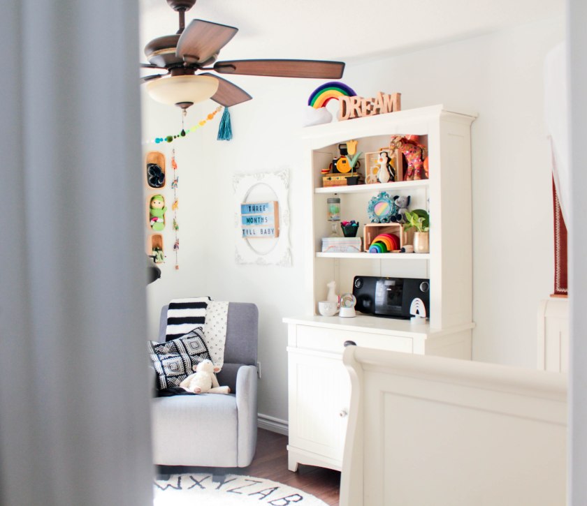
I’ve recently been inspired by white spaces, and embracing the idea that the bold and colorful décor should be the highlight of the space. As a color lover I previously had this all backwards and often did bold walls, and simple décor, which just wasn’t feeling like my jam. So in this nursery we decided to carry on with the white from out hallway, Behr Falling Snow which has just a subtle hint of warmth to it, but still has a crisp white appearance.

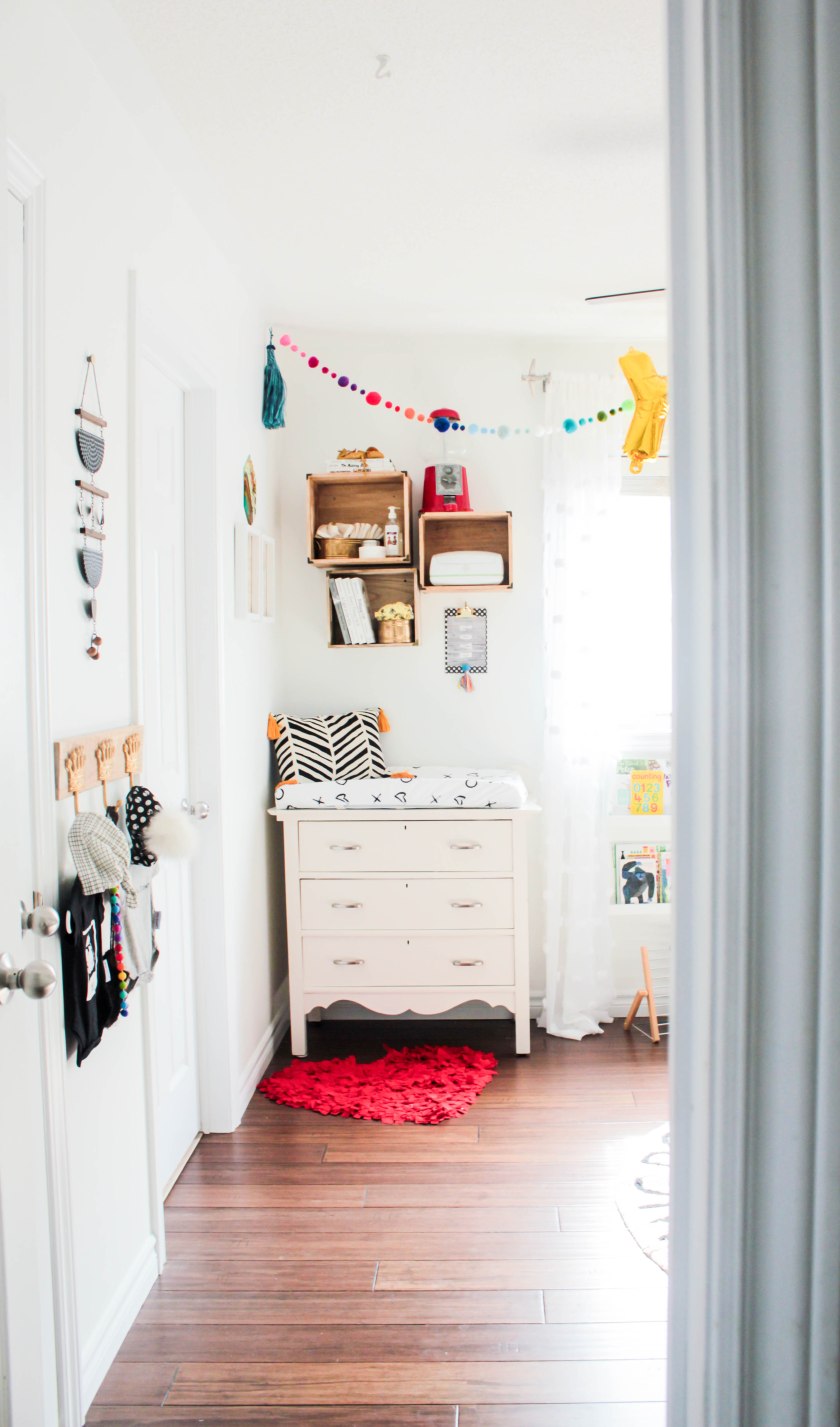
We are reusing all of the nursery furniture from Elliotts room and purchased the 8 drawer Ikea Hemnes dresser for our boys to share instead. These pieces I picked 5+ years ago, for that hint of vintage, and complete nursery practicality just didn’t serve us the same in a big boy room so its convenient that they get renewed life in here.
Aside from switching out the dresser, we kept the diaper change area the same as when Oliver was here, Its conveniently located next to the Jack and Jill washroom and since we cloth diaper, that’s where soiled diapers will be rinsed and stored until wash day. I’ve added an extra wall mounted crate for storage since it felt like it was lacking a bit on the last go around and was lucky enough to find an almost identical crate with slightly less depth as the two existing ones.

We use the top drawer of the dresser exclusively for prepped diapers and the crate space for extra inserts, diapers creams, and our wipes warmer for those in-between changes. The other drawers are ample room for the basics of newborn clothing so there isn’t any lack of storage here.
The rest of the room took a layout change. I never loved how I had Olivers furniture situated and was consistently moving the furniture around in here to make the room feel bigger. With Elliotts nursery pieces instead, the furniture doesn’t have an overbearing feel here. The crib lines our hallway wall, which makes it the last thing you appreciate when you walk in, but it makes sense for the space, and pulls the crib away from the feature wall which is inconveniently against our dryer in the room behind it. This happened to be a source of sleep disturbance for Oliver, so I took that into account this time around.


I previously used the hutch as a bookshelf because I didn’t want our reading material to be thrown, torn, and chewed by infant and toddler hands, but have since come to realize the love of books is born with accessibility so this room got a toddler friendly reading nook all its own instead. These picture ledges from Walmart provided the perfect display of reading material, so much so, that the boys now gravitate here instead of their room. Naturally I curated a book collection based on color, sizes, and the overall quality of the story to put in here because I am over the top like that, but it sure looks pretty!
The rocking chair is an oldie but a goodie from Toys-r-us and while it was our big splurge from Olivers nursery, it has proven its worth over and over again. We learned quickly that salvaging an impractical vintage rocker as seen in Elliotts nursery wasn’t worth the savings and have since made sure to make our reading nook equally as comfortable as it is pretty.
Perhaps the room has a feminine flavor with the small touches of rainbow throughout. I did try for the most part to limit my rainbow pieces to those with deeper jewel toned hues, but to be honest, most of these pieces found their own way into this room without me ever looking. Kismet I suppose.


My favorite vignette has to be this sweet collection on rainbow silhouettes on vintage music paper. These Etsy prints were salvaged from Olivers nursery and reframed in smaller white frames to fit the overall crispness of this room, and I suddenly appreciate them so much more. The stained glass piece was actually a $1 thrifted item that I bought for our laundry room, but ended up not quite fitting in there, and eventually became the overall inspiration for our Rainbow babies room.


Almost all of the other wall art were shopped from around our home, meaning they were pieces that were already purchased and existed without ever having been intended for this space. Nearly everything were thrifted items that just jumped out at me over the last couple of years so I feel confident knowing I have layered the walls with bits of my soul which has so much intention and meaning to this space. The white frame may be recognized as a piece from Elliotts nursery which was teal at the time, I debated painting it any of the rainbow colors but ultimately decided that white with black antiquing would make the biggest impact while also growing with the space. The wicker basket collection was actually purchased for our bedroom but given its matching wood tone to everything else, just had an overall better fit in the nursery. A unexpected element is the plant hanger to the left of the crib, you might be surprised to discover it was a woven purse (likely made in Mexico) that I actually used for a couple of days before realizing that it matched that Turtle tapestry almost perfectly… in that moment my brain began to process how it could be incorporated in a potentially masculine space and it didn’t take me long to realize it would make a kick-ass plant hanger.

Truth be told, I never had any clear direction with my crib bedding. I learned from the other two boys that expensive custom Etsy bedding wasn’t worth the investment, so I had no intention of doing that a third time around. I also knew I didn’t want a matching comforter or bumper pad because they are essentially useless. In reality each element of the crib bedding was bought separately, starting with the sheets that I bought ages before I knew I would be pregnant. More recently the various throw pillows, and grey blanket were all discovered at different times on clearance at Homesense, Winners, and Walmart. Absolutely nothing was intentional and it is not a set, though you would never know. Believe it or not the crib skirt was a piece from Olivers bedding and had mint and navy stripes along the bottom, I simply purchased a black and white ribbon that was slightly wider than the existing and sewed it right over the mint and navy. That mobile was handmade from felt, felted poms, and, some wood doweling, a super simple DIY, but totally makes the space.


Since we have most of our essential baby items already, its easier to splurge on some design elements in second and third nurseries. In this space those splurges were the bed canopy from Pottery Barn, and the Lorena Canals ABC rug that I instantly fell in love with and had to have.

The colorful poms, tassels, and the balloon banner were all strung together, super easily with simple craft elements from Michaels. The pom poms actually existed in Olivers room and was first crafted as party décor for Elliotts birthday, and has traveled from room-to-room and house-to-house since its creation. Other great elements include the Canadian made Rainbow tassel banner from etsy, and the string of elephants, and my wicker table both from The Violet Door, add the layered worldly touch I was vibing through the process.
I am sharing this space as inspiration to all of you that it doesn’t take a lot of money to pull together something fantastic, If you have the direction in inspiration in mind the right pieces will find you if you take the time to source them properly.
Thanks for taking a peek!!
xoxo
Ella